Veloria
Marketing site, waitlist funnel, and app-store compliance pages for a women's health startup.
VELORIA
Your Pleasure, No Pain
- Verification Paths
- 3
- Prod Dependencies
- 4
- Pricing Tiers
- 3
- Client
- Veloria
- Industry
- Women's Health · Femtech
- Founder
- Alexandra Prochshenko
- Status
- Complete
- Duration
- April 2026 · ~3 weeks
- Scope
- Marketing site, waitlist funnel, compliance pages
01 Overview
Who is the client?
Veloria is a women's health startup building a mobile app for women dealing with vaginismus, vulvodynia, pelvic spasm, and penetration pain and anxiety — combining daily guided hypnotherapy audio sessions with physiotherapy exercises (breathwork and dilation work) and self-reflection prompts, under the tagline "your pleasure with no pain." The team spans Vancouver, Calgary, and Toronto and includes a pelvic floor physiotherapist. This engagement covered the web side of the launch: the public site that explains the product, captures the pre-launch audience, presents pricing, and satisfies the legal and app-store requirements the mobile app can't ship without.
02 Problem Statement
What problem were they facing?
Veloria was preparing to launch an app in a category where trust is everything and the subject is difficult to talk about. They needed three things from the web: a site that could speak to a sensitive medical topic with warmth and credibility, an audience before the app existed to launch into, and the unglamorous launch blockers Apple and Google won't wave through.
Trust before subscription
A woman researching this problem needs to feel understood before she'll consider an app for it. The site had to name the conditions plainly and put real faces behind the product — without tipping into either clinical coldness or unearned softness.
No audience before launch
The app wasn't live yet, so the site's job was to convert interest into a waitlist the team could actually market to, with proper consent, feeding directly into their email platform rather than a spreadsheet someone has to export.
App-store deletion path required
Apple and Google both require a public, working account-deletion path before they'll approve a health app. No page, no store listing — and the flow has to handle Google, Apple, and plain-email accounts.
No public pricing or legal pages
Subscription pricing wasn't published anywhere, and the privacy policy and terms of service the app store submission depends on didn't exist yet.
03 Solution
How did we solve it?
We built the site as a lean Next.js application — deliberately small, fast, and content-first. Four production dependencies, static content in code, no CMS and no admin panel a pre-launch site with rarely-changing content would never use.
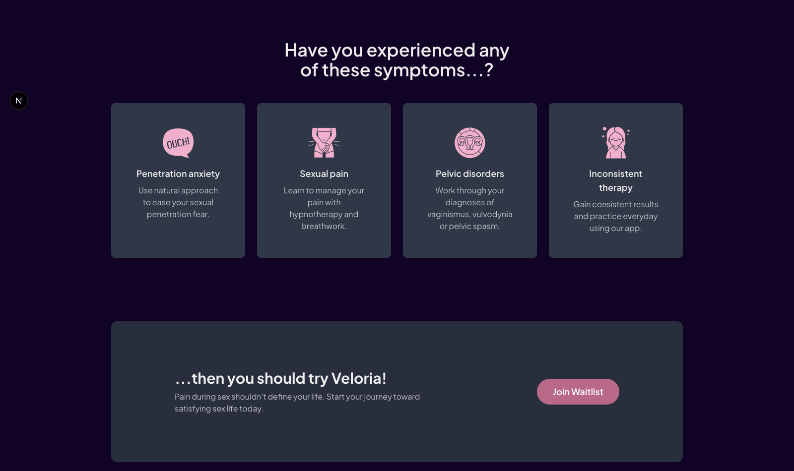
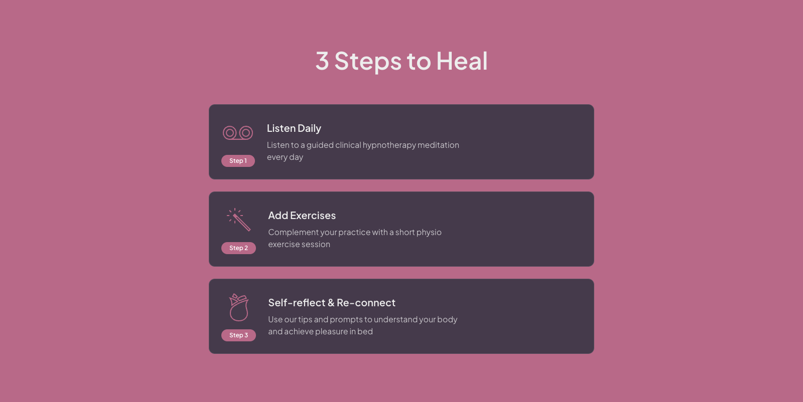
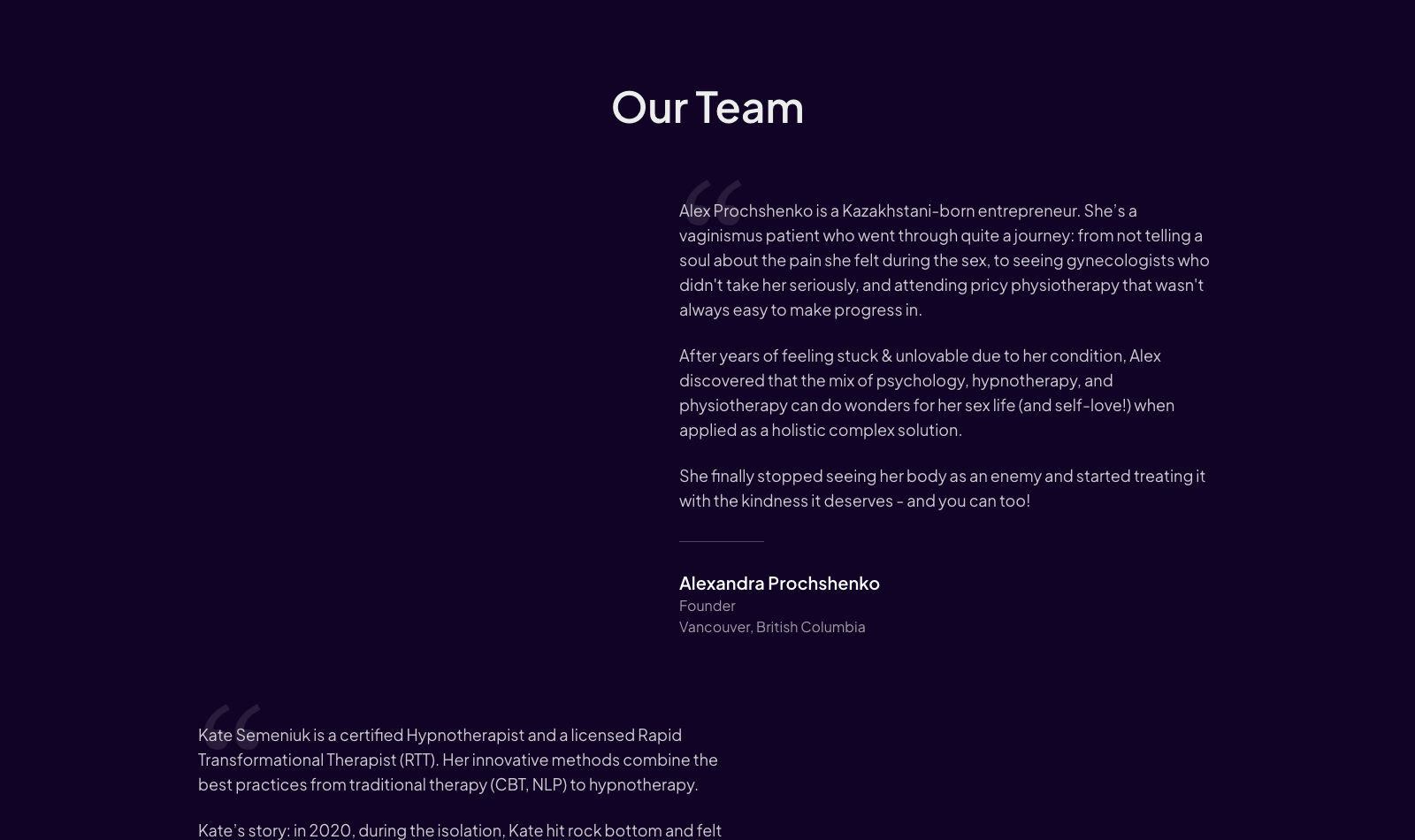
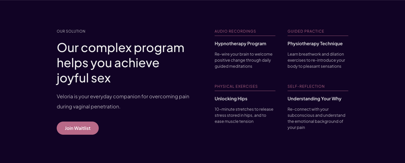
The homepage walks the visitor through the emotional arc of the product: a hero with a typewriter headline, a symptoms section that names what she might be experiencing, a solutions section explaining the two program tracks and the "understanding your why" reflection work, a how-it-works section laying out the daily routine, and a team section introducing the founder and clinical backgrounds. The design leans soft — floral graphics, warm palette — matching the reassuring tone the subject demands.
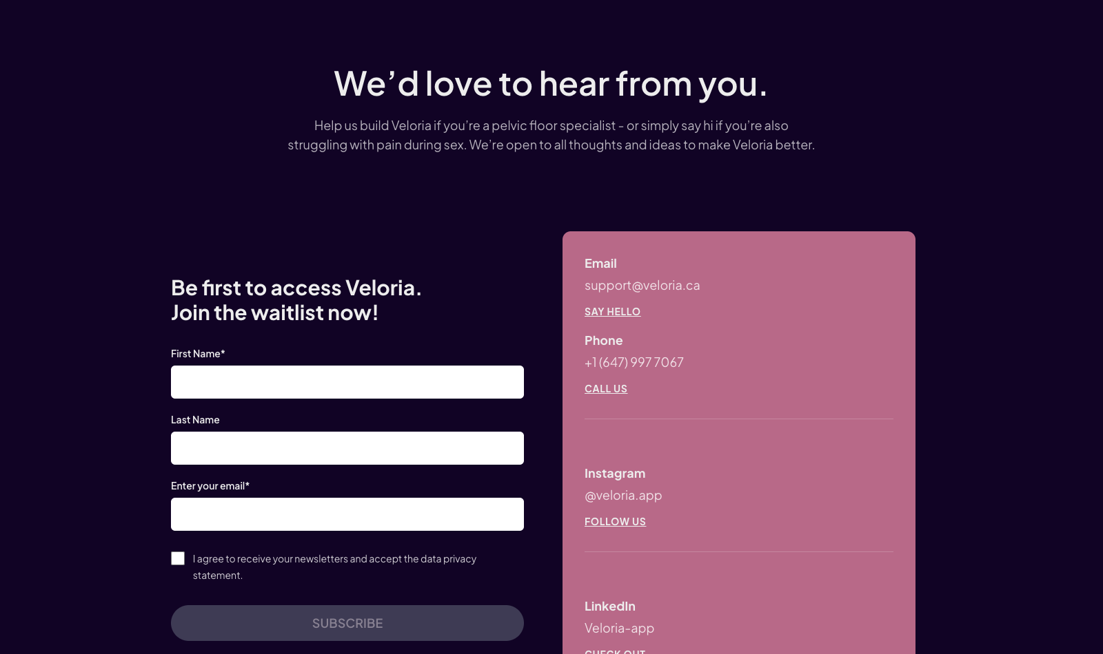
The waitlist form is wired for marketing from day one. Submissions go through the server-side API route into Brevo with first name, last name, email, and an explicit marketing opt-in — the form won't submit without it. Validation runs live as the visitor types, errors from Brevo are surfaced properly, and duplicate signups update the existing contact rather than failing.
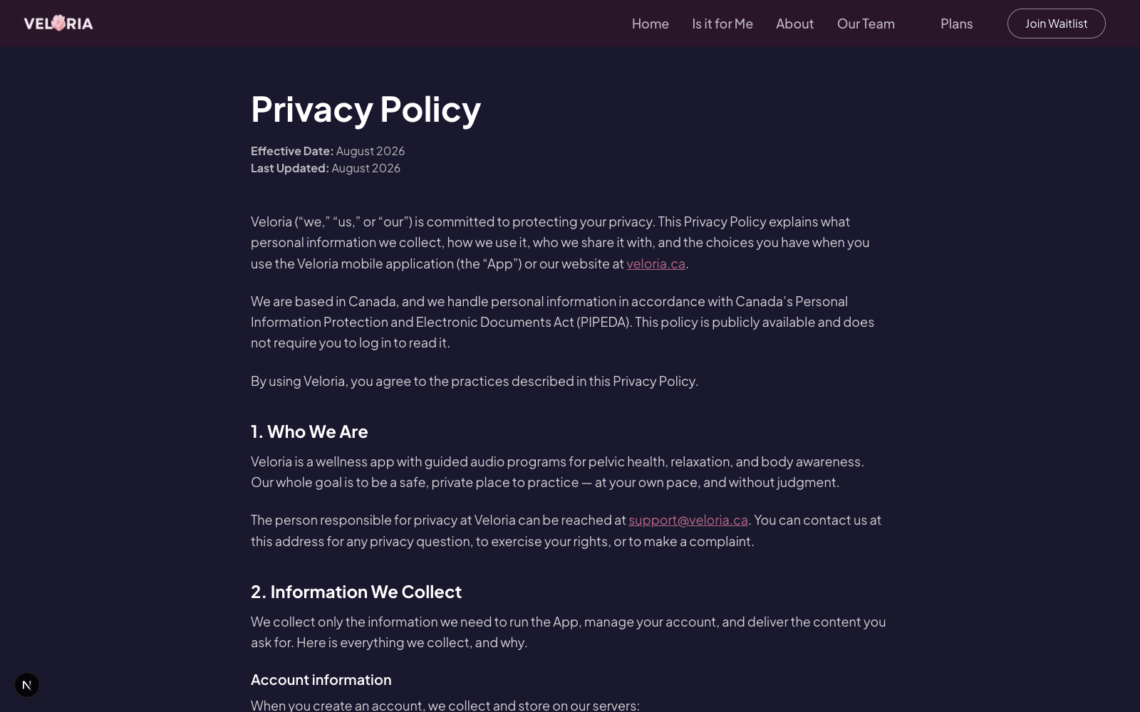
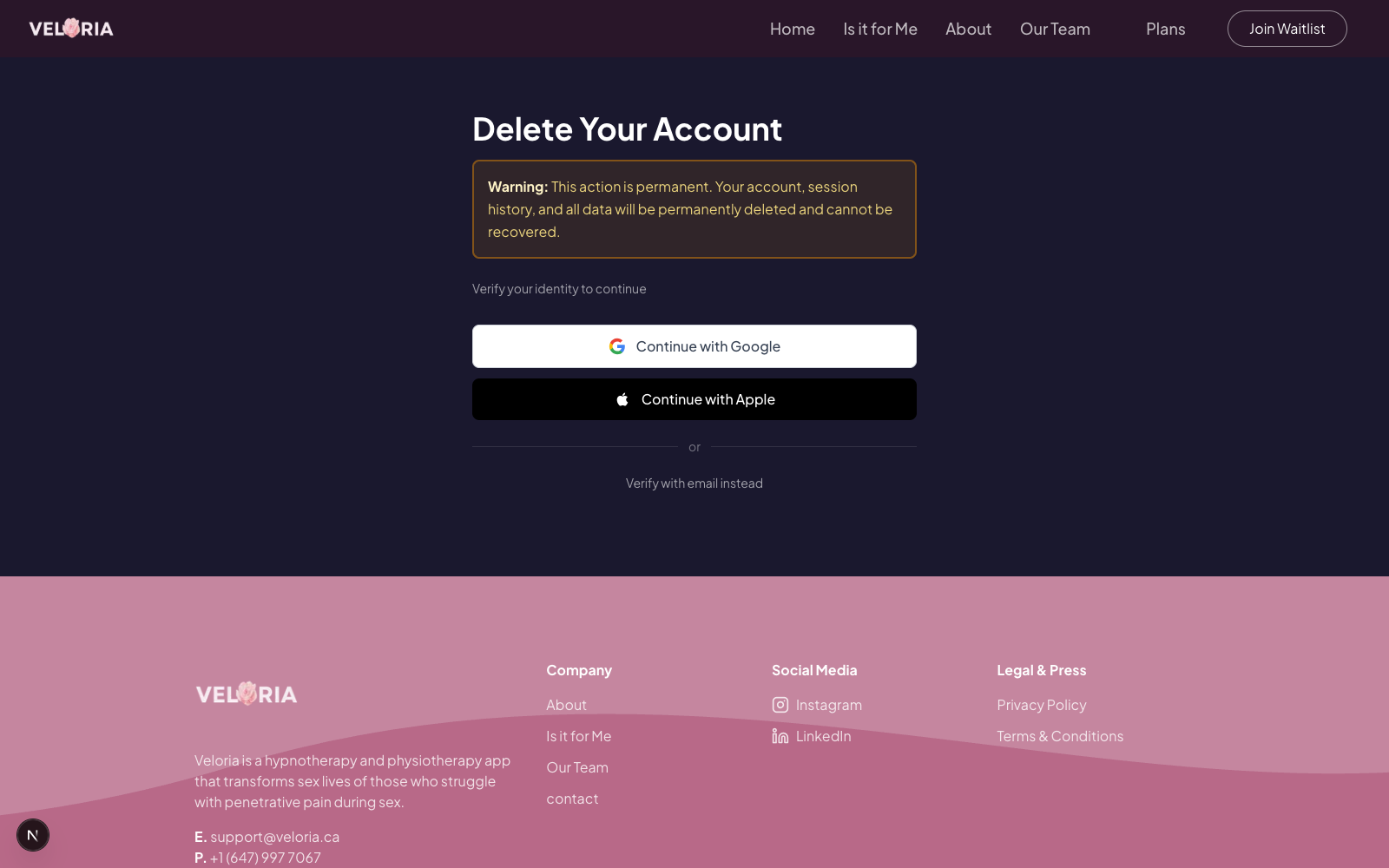
The piece with the most engineering in it is the account deletion flow at /delete-me, built to meet Apple's and Google's requirements. A user verifies ownership three ways — Google, Apple, or a six-digit email code through custom PocketBase endpoints with a 60-second resend cooldown — then types an explicit confirmation before deletion executes. Privacy policy and terms pages round out the compliance set.
- Site Next.js 16 Public marketing site React 19Tailwind v4
- API Server API Route /api/waitlist → Brevo Consent-gatedKey stays server-side
- PB PocketBase App's existing backend Email code verify60s cooldown
- Next.js 16
- React 19
- TypeScript
- Tailwind CSS v4
- PocketBase SDK
- Brevo API
- Server-side API Routes
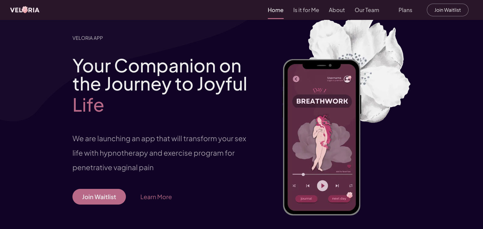
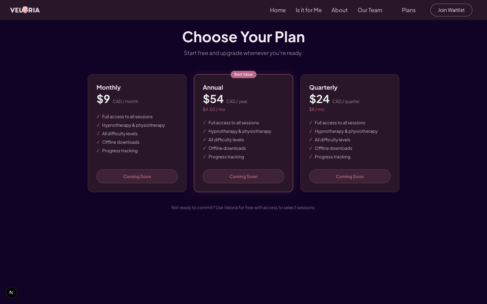
Live pages — built and shipped
04 Project Timeline
Key milestones and duration
Phase 1 April 6–15, 2026
Design & Homepage
Site structure, visual direction, and the full homepage: hero, symptoms, solutions, how-it-works, team, and contact sections, plus navigation and footer.
Phase 2 April 15–20, 2026
Waitlist & Pricing
The Brevo integration with its server-side API route, consent-gated form with live validation and error handling, and the plans page.
Phase 3 April 20–24, 2026
Compliance & Launch Prep
Privacy policy, terms, and the three-path account deletion flow against the app's PocketBase backend.
05 Challenges & Resolutions
What obstacles did we face, and how did we overcome them?
Warmth without losing credibility
problemHealth topics this personal are easy to get wrong in both directions — too clinical and the site feels cold, too soft and it stops being credible.
resolutionA structural split: name the conditions directly in the symptoms section so a visitor sees her own situation in plain words, then ground the solution in its clinical components — hypnotherapy, physiotherapy, a named pelvic floor physiotherapist — so warmth and credibility carry different sections instead of competing in the same sentence.
A waitlist that's safe to use commercially
problemCollecting emails for a health product means consent can't be implied — an opt-in checkbox alone isn't enough if it's not enforced and recorded properly.
resolutionThe opt-in is required, stored as an attribute on the contact, and the form is inert until it's checked. Routing the submission through a server-side API route keeps credentials private and gives us a place to translate Brevo's error codes into messages a visitor can act on.
Deletion had to work for three kinds of users
problemSome users sign up with Google, some with Apple, some with plain email — and each needs a different proof of ownership before an irreversible account deletion runs.
resolutionOAuth users re-authenticate through their provider; email users get a one-time code with a resend cooldown to prevent hammering. All three converge on the same type-to-confirm step, because deleting a health account should never be one accidental tap away.
Keeping a pre-launch site small
problemIt would have been easy to give a startup site a CMS, an admin panel, and a component library — expensive to host and with plenty of surface area to break.
resolutionNone of that shipped. A handful of pages, four production dependencies, static content in code. For a pre-launch site whose content changes rarely, that's cheaper to run and has almost nothing that can break.
06 Before & After
Comparison of the situation before and after the project
| Before | After |
|---|---|
| Web presence: none | Full marketing site with a designed narrative for a sensitive health topic |
| Audience building: no capture mechanism | Consent-gated waitlist flowing directly into the email marketing platform |
| Pricing: not public | Plans page with three tiers — $9/mo, $24/quarter, $54/year |
| App store readiness: blocked — no deletion path, no legal pages | Compliant deletion flow (Google, Apple, and email verification) + privacy and terms |
| Credential safety: — | All third-party keys server-side only |
07 Client Benefits & Outcomes
What value did the client gain?
- Verification Paths
- 3
- Google · Apple · email code
- Pricing Tiers
- 3
- $9 · $24 · $54 CAD
- Prod Dependencies
- 4
- next · react · react-dom · pocketbase
- Resend Cooldown
- 60s
- anti-hammering on email codes
Marketing can start before the app ships
Every visitor the team drives to the site can convert into a properly consented contact in their own email platform — no exports, no manual list management — which means the launch lands on a warm audience instead of a cold start.
The app-store path is unblocked
The deletion flow and legal pages are the kind of requirement that delays launches by weeks when discovered late; they're done, live, and built against the app's real PocketBase backend.
Costs almost nothing to run
No infrastructure to babysit and no CMS to secure — appropriate for a startup whose engineering attention belongs on the app, not the website.
A public face that treats its subject seriously
For a product whose customers arrive via a private, often embarrassed search, a site that names the problem plainly and answers it credibly is doing real conversion work.
08 Key Learnings & Takeaways
What did we learn from this project?
Match the build to the site's actual job
A pre-launch marketing site with rarely-changing content doesn't need dynamic infrastructure — static content in code with four dependencies beats a CMS it would never use.
Consent is a feature, not a checkbox
Wiring the opt-in through to the marketing platform as data, and gating the form on it, makes the list safe to use commercially from the first signup.
Build the exit as carefully as the entrance
The deletion flow serves users at their least happy moment and regulators at their most attentive; three verification paths and a type-to-confirm step is the right amount of engineering for a page everyone hopes stays unvisited.
Sensitive topics reward directness
The site's most important copy decision was naming the conditions instead of talking around them — recognition is what turns a visitor into a signup.
Built pages · live on the running site
The Product
Every screen shown here is a real render of the shipped site. Click any to expand.